Friday, 29 November 2013

Feature Article Draft Analysis


Layout
I have include the magazine's logo in the top left hand corner of the page and the page number and magazine's website on the bottom right of the page. This compliments the magazaine's house style as well as providing repetition to make the website and logo more memorable.

The article title is bold and large and will run across the top of the left hand page. This makes it stand out from the other text in the article allowing the reader to have a brief summary of what the article will be about before reading. I will also include an entry point of text just below the title, in order to provide a bit more information about what the article will be about and leave the reader wanting more, and thus making them read the rest of the article.

I have put a large picture of the feature artist, taking up the majority on the page on the right. I did this because the right page is known to be the first place the reader will look, and so providing the image of the 'well known music artist' will immediately attract the attention of the reader and make them want to read further into the article.

I also layed out the text of the article into two columns. This makes the page neat and easy to read as well as fitting with the house style of the magazine. At the beginning of each paragraph/ question of the interview I will use a drop cap. This in turn clearly marks the beginning of each question, making the page easier to navigate, as well as being eye catching which draws the reader to text to make them read on.

Other Features
The text of the magazine will be in an interview style. This creates a more casual atmosphere for the reader and allows them to relate to the artist. It will also include popular questions which the readers are likely to want to know the answer to, tempting them to read the article.

Feature Article Draft


Wednesday, 27 November 2013

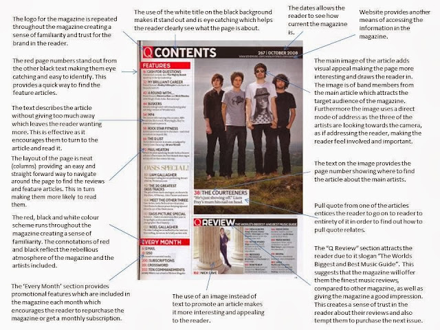
Contents Page Draft Analysis

Layout
The title "Contents" run across the top of the page in big capital letters which make it bold and eye catching. This can help highlight the important of the page.

I have included the date under the title so that the reader can see if they are up to date with the magazine issue.

The magazine logo is in the top left hand corner. This will run throughout the whole magazine to repeat the brand name making it more memorable which is part of my house style.

I have put the website and page number in the bottom right hand corner. This provides another form of media to view the magazine and fits with the magazine's house style. The page number also makes the magazine easier to navigate.

The page is layed out in two columns to make the page simple and easy to navigate. It also makes the page neater and therefore more appealing to the eye. This also compliments the magazine's house style. The pictures will be on the left, which will include the page numbers to show the page the artist is featured on. I have placed the list of text on the right of the page. This is because it is known that the reader first looks at the right hand side of the page and so by doing this they will immediately get an idea of what the magazine will include. This in turn can tempt the reader to look at the rest of the magazine.

Other Features
For the subtitles such as 'features' and 'news' I will use a bold but also "swirly" font to echo the female orientated target audience.

Wednesday, 20 November 2013

Content Page Draft


Front Cover Draft Analysis

Layout
The masthead goes the whole way across the top of the front cover. This is effective as it makes it stand out from the rest of the page.

The artist's head will slightly cover the masthead to create the effect that the magazine is well established and popular enough to do so.

The date is placed at the top left of the page to allow the reader to make sure they are up to date with the magazine issue.

The website is included in the bottom right hand corner to provide a different type of media to view the magazine, which can help boost viewings.


The feature artist is the centre of the image as well as taking up the majority of the page. This allows her to be the centre of attention on the page and draws the readers eye to her.


Other Features
I have decided that I will include two puffs which include a 'free CD' of the feature artists first single and a 'free poster' of one of the content page artists. This is because I believe it will help tempt more readers to purchase the magazine.

Friday, 15 November 2013

Inspiration for Upgrade


I choose these magazines as I think that the simplicity of having just one image makes it look sophisticated and professional. Also the use of the plain white studio background helps this as there is nothing in the background to distract the reader. I think it also makes the reader focus on the feature artist which is what I want to achieve. 

Wednesday, 13 November 2013

House Style

Colour Scheme
My  magazine I will keep a constant colour scheme in order to keep atmosphere throughout the whole magazine. The colours I will include are black, white and lilac as I think the black and white will make my magazine look expensive and professional whilst the lilac echoes the female orientated.
On the pages of the magazine i will use the black for pages numbers, titles, slugs and text. The white will be used for the background and the lilac to underline the title and line the page and pictures.
Font
Body Copy Ideas:
 

 I have chosen these fonts as they are simple and easy to read as well as suiting the classy look of the magazine.
 I have chosen the 'Centaur' font for body copy as it is simple and easy to read. The font colour also fits the black and white colour scheme of the magazine creating a professional look. Furthermore the slenderness of the font helps reflect the feminine feel of the magazine and it also has a resemblance to the masthead.

Visual features
On every page of the magazine I will include the website in the bottom right hand corner. I think this will be effective as many people (especially my target audience) are becoming more and more technologically advanced and often rely on their computers as a source of information, so providing this way to read the magazine may help gain readers. Also the fact it is repeated on every page will make it more likely for the reader to see it and will add consistancy to the pages.

I will also include a visual symbol of a 'U' based on the font of my masthead appearing on each page. This is because it allows the name of the magazine to be repeated throughout making the name more memorable and likely to stick.

Furthermore I will keep the layout of the feature articles consistant. To do this I will make sure I use three coloumns on each page. I have decided not to use boarders around the images because I think it takes away the

Friday, 8 November 2013

Chosen Masthead


(Font: Dubiel)
I have chosen this masthead because it will stand out on the front cover due to it's capital,bold and black font. As well as this it is also simple and has well spaced letters making it easy to read and therefore memorable.

My magazine genre is music fashion and i believe that this font connotates high end fashion magazines such as vogue which will be effective to mix with the theme of music.

(MF Music magazine)
 
 I think that the font looks expensive and professional which is what the magazine is aiming to achieve.

Masthead Idea Analyses


Thursday, 7 November 2013

Masthead Ideas


Final Brand Name

I have chosen 'Upgrade' for my magazine name. This is because it reflects the idea of evolving and keeping up with the latest trends, which is what the magazine is trying to achieve. This in turn will engage the target audience and tempt them to purchase the magazine as they have the desire to be very current with their music and fashion. The term also suggests the idea of being more advanced implying the readers will gain something from the magazine that non readers will not have. This creates the sense that they are privileged.

'Upgrade' is also a short two syllable word which makes the name to the point and memorable causing the name to 'stick'.

I choose not to use the other ideas (Download, Listen and Vibe) because i think that the connotations of these names are not as suited to my magazine as 'Upgrade' and therefore would not be as effective.

Monday, 21 October 2013

Brand Name Ideas


Contents Page Artist Ideas and Planning

The artists featured will be less well known than my main artist so that the attention of the readers is focused on her. However, they will all relate to the pop fashion genre to suit the style and target audience of the magazine to entice the audience to purchase it.

Sophie B
Sophie is a pop solo artist promoting her first album. She has recently become well known but believes that featuring in the magazine may boost her popularity.The magazine will include an exclusive interview with her talking about her album and how she became famous.

AlunaGeorge
AlunaGeorge are a pop duo made up of Aluna the singer and George the DJ. The group are very popular with the target audience which can encourage them to read the magazine. They have performed at a variety of festivals and gigs. The magazine will feature tour dates and posters, as well as a small interview talking about their festival experiences.

Chris Brown
Chris Brown is a very well known and established music artist. His popularity and good looks will attract the feminine orientated target audience.

Sunday, 20 October 2013

Photo Shoot Plan


LOCATION
-Minimalistic studio with a white background. I think this will be effective as the blank uninteresting background will draw the attention of the reader to the artist. This can echo the idea that the article is all about her.
- I think that the white background also makes the photo shoot look edgy, expensive and professional.
Even though the background is very blank I think that the shoot will be able to portray her personalty through the choice of her costume, make up and pose.
- I would like to base my images on the photo shoot of Rihanna by Terry Richardson as I think that he achieved the effects i want to achieve.
  • Artist's look
- Clothing: Patterned trousers and crop top
- Hair: Volumous 'beach look' with ombre
- Makeup: Smokey dark eyes with natural lip and skin
- Shot type/ angle/ distance: Full portrait shot
-Connotations: stylish, expensive, flirtatious
-Lighting: High key and natural
-Props: Non


Sunday, 15 September 2013

Analysis of Completed Problems Page

Overall I think that my problems page was successful as I used many typical conventions of a successful problems page, for example the layout in columns, a friendly picture of the agony aunt, a slogan, a bold title, subtitles, images and quotes. However I also challenged some of the conventions so that the article would suit the theme of the magazine. I did this by making my target audience both genders, instead of being female orientated, and this is shown through my colour scheme and font. The colour scheme is blue and pink to reflect the target audience and the font is not swirly and feminine, like a typical problems page. Moreover I believe that the fact I challenged this convention makes my problems page unique and stand out as well as more interesting for the readers.

To get feedback on my problems page I questioned a range of people who were the age of the target audience and recorded their answers:
From this I discovered that many of the males from the target audience did not feel the colour scheme was masculine enough and therefore would not be interested in reading the page. To improve this is I would try to use more masculine colours and maybe an alternative colour to pink to reflect the girls, such as a purple, as the pink may be too feminine. Furthermore to improve I think I should use a different software as the second person I questioned said that they felt the page didn't look professional enough as a result of this.

On the other hand my choice of design features such as the font and layout were very successful as the interviewees found that the layout was easy to follow and interesting and the font was suitable for both genders of my target audience.

For my main coursework portfolio I think I need to work on making my work look more professional looking by using more advanced computer software such as adobe indesign. I also need to make my colour schemes more suitable for my target audience and to make sure I do this I will do more market research before designing.

Friday, 13 September 2013

Agony Aunt Page Design


Readership Profile and House Style

Readership Profile

The magazine that I am creating is a sixth form magazine so I have decided that the appropraite target audience age range would be 15 to 18 year olds. I have chosen 15 as my youngest age because it is the age just before entering the sixth form and so the magazine can provide useful advice about what life is like in the sixth form and how to prepare for it. The age range increases to 18 because this is the age of the final year of sixth form allowing the magazine to support and advise the whole way through the sixth form. The magazine will also include the issue of the different options people have to go to after sixth form which is a very common concern for the 16 to 18 year olds.

As many sixth form's are mixed gender the target auidence for the magazine will be for both boys and girls. Many of the students of both genders will suffer from uncertainty and want advice during their time at the sixth form, from problems such as making new friends to struggling with the jump from GCSEs to A level which the magazine will deliver.

The people that will be interested and buy this magazine will be those of take their studies seriously and want to make the most of their time at the sixth form. The target audience are not all top grade students, but they work very hard to achieve the best that they can. Furthermore they are able to manage their time effectively to make time for hobbies and not just school work.

House Style
I have decided to call my magazine 'advanced assignment' meaning latest assignment. This is because the words reflect the theme of school and education, echoing the theme of the magazine. Furthermore the use of aliteration is catchy and gives a more fun and relaxed feel to the magazine. The slogan for the magazine will be 'In order to succeed, you must read'. I think this is effective because again it fits the idea of school and studying. It also includes a rhyme which makes it catchy and memorable.

The colour scheme will be a mixture of pinks and dark blues reflecting the concept that the target auidence are both boys and girls. (The pink portraying girls and the dark blue boys). I chose dark blue instead of light blue so that the colour scheme would not be overly feminine.
                                     I have chosen these three fonts as they are not too
 masculine or two feminine, making it suitable for the target audience. I will used the third one as the dominant font as it replicates hand writting which can be associated with school and work.  
 

Agony Aunt Annotations


Monday, 9 September 2013

Conventions of a magazine's problem page

  • Female orientated
  • A picture of the writer of the article.
  • The writer of the article reflects the problems of the audience. (e.g. a doctor for health problems)
  • Writer of the article is friendly looking creating the sense they are easy to talk to and trustworthy.
  • One interesting main story/question, which the layout makes eye catching, followed by more smaller questions.
  • Slogan enticing people to read the article.
  • Often related to everyday problems that many people will face attracting a broad audience.
  • Includes clear questions and answers making the layout easy to follow.
  • Girly colour schemes (pinks, light blue, etc.) reflecting female target audience.
  • Drop caps are commonly used to clearly indicate the questions from the answers.
  • Article layed out in columns.
  • Images echoing the theme of the questions.
  • Feminine fonts reflecting the female target audience.
  • Quotes from the questions, often shocking to entice the reader.
  • Subtitles for each question to summaries what they are about.
  • Contact information for the writer to encourage the readers to write in.